Visualization
2 minute read
Fast Implementation
The easiest way to generate a visualization is by running a single command.
This will create an interactive HTML page based on your indexed data.
You can view a live example with the Harry Potter corpus here: Example
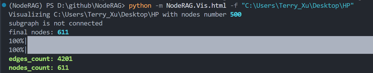
python -m NodeRAG.Vis.html -f path/to/main_folder
You can also control the number of nodes displayed using the -n flag.
Note: The final number of nodes may exceed your selected value, as we apply internal optimizations for visualization quality.
We’ll explain the details behind the visualization process later.
python -m NodeRAG.Vis.html -f path/to/main_folder -n 600
What’s Behind the Visualization
Generating a visualization with thousands—or even tens of thousands—of nodes and edges is highly resource-intensive and often impractical for browsers.
Therefore, NodeRAG’s visualization does not use all nodes from the corpus. Instead, it selectively includes a fixed number of important nodes based on relevance.
How Nodes Are Selected
Node importance is calculated using the PageRank algorithm.
NodeRAG ranks all nodes by importance and selects the top n nodes for visualization, where n is user-defined.
Best Practice: Set
nto 1000 or less for optimal performance. Higher values may cause rendering issues in HTML browsers.
Ensuring Graph Connectivity
A common issue is that the top-ranked nodes may not form a fully connected graph.
To solve this, NodeRAG applies the Bidirectional Dijkstra Algorithm on its heterogeneous graph to extract additional linking nodes.
This ensures the final visualization is fully connected, with no isolated nodes.
Note: This is why the total number of nodes in your visualization may exceed your specified
nvalue.
Feedback
Was this page helpful?
Glad to hear it! Please tell us how we can improve.
Sorry to hear that. Please tell us how we can improve.